# Libraries
library(tidyverse)
library(tidymodels)
library(gridExtra)
library(scales)
library(knitr)

# Tidymodels Settings
tidymodels_prefer()
conflicted::conflicts_prefer(dplyr::lag)

# Setting the theme
theme_set(
  new = theme_classic() + theme(plot.title = element_text(hjust = 0.5))
)Customer Churn in Beer Industry
Introduction
In this case study, we follow a Data Science approach to predict customer churn in the beer industry. Specifically, we outline the key steps involved in building a predictive model from scratch, designed to determine whether a customer is likely to churn based on their historical purchases and reported complaints. This analysis was conducted with R (within RStudio), leveraging the tidyverse and tidymodels packages. Every piece of R code is provided and the datasets employed are publicly available on GitHub, allowing anyone to replicate the process and achieve identical results.
We begin by loading the necessary R packages and importing the two datasets. The next step involves exploring the data to uncover any notable insights or patterns. Following this, we define customer churn in the context of this specific problem and apply this definition to the data. With the churn definition established, we split the data into two subsets: the training set and the test set. Random Forest is used as predictive modeling methodology to fit the data in the training set, with hyperparameter optimization. After selecting the best model, we re-fit it using the combined training and validation sets, and then use the test set to generate predictions. Finally, we compare these predictions against the actual values to evaluate the performance of the chosen model.
Libraries and Importing Data
To begin, we load the necessary R packages and configure a few settings, such as the theme for our plots.
Next, we import the primary dataset, which includes transactions from our company of interest. This company sells beer, snacks, and beverage accessories to professional customers, such as hotels. The dataset contains 188,683 rows and 7 columns, and covers a period of approximately five years (from 2019-08-09 to 2024-08-06). The description for each column is the following:
Customer_ID: A unique identifier for each customer.
Date: The date of a product purchase.
Category: The product category (Beer, Accessories, or Snacks).
Revenues: The revenue amount in dollars.
Purchase_Channel: Indicates whether the purchase was made “Digital” or “Not-Digital.”
Customer_Tier: The tier assigned by the company, with possible values “Standard,” “Premium,” “Elite,” and “Exclusive,” ranked from lowest to highest in terms of benefits.
Customer_Segment: The business segment of the customer, with possible values “Breweries & Taprooms,” “Hospitality & Dining,” “Hotels & Accommodations,” and “Retail & Convenience”.
We import the data set with the read_csv() function and then we use the glimpse() function to check the structure.
# Import the data set "Beer Purchase"
beer_data <- read_csv("https://raw.githubusercontent.com/GeorgeOrfanos/Data-Sets/refs/heads/main/customer_churn_in_beer_industry/beer_purchases.csv")

# Check the structure
glimpse(beer_data)
Rows: 188,683
Columns: 7
$ Customer_ID <dbl> 1054006334, 1053959561, 1053975433, 1053977693, 10547…
$ Date <chr> "5/18/2022", "2/18/2022", "2/26/2020", "12/15/2020", …
$ Category <chr> "Beer", "Beer", "Beer", "Beer", "Beer", "Snacks", "Be…
$ Revenues <dbl> 153.93, 422.09, 1059.29, 749.85, 226.94, 154.57, 177.…
$ Purchase_Channel <chr> "Non-Digital", "Non-Digital", "Non-Digital", "Non-Dig…
$ Customer_Tier <chr> "Elite", "Premium", "Exclusive", "Elite", "Premium", …
$ Customer_Segment <chr> "Retail & Convenience", "Hospitality & Dining", "Hosp…The output is as expected, but two adjustments are necessary:
Customer_ID should be converted to a character type, as it serves as a unique identifier with no inherent numeric value. To avoid confusion, we’ll add the letter “C” at the beginning of each ID.
Date should be reformatted to follow the ISO 8601 standard format (YYYY-MM-DD).
# Modify data types in the necessary columns
beer_data <- beer_data %>%
  mutate(
    Customer_ID = as.character(paste0("C", Customer_ID)),
    Date = mdy(Date)
    )
We also need to import a second dataset that records customer-reported complaints. This dataset consists of 301,301 rows and 3 columns, described as follows:
Customer_ID: A unique identifier for each customer.
Date: The date on which a purchase was made.
Complaints: A value of 1 in each row, indicating that a complaint was reported on the corresponding date.
# Import the data set "Customer Complaints"
complaint_data <- read_csv("https://raw.githubusercontent.com/GeorgeOrfanos/Data-Sets/refs/heads/main/customer_churn_in_beer_industry/customer_complaints.csv")

# Check the structure
glimpse(complaint_data)
Rows: 301,301
Columns: 3
$ Customer_ID <dbl> 1053471513, 1053471513, 1053471513, 1053528816, 1053528886…
$ Date <chr> "12/10/2019", "11/25/2020", "1/21/2022", "12/16/2020", "2/…
$ Complaints <dbl> 1, 1, 1, 1, 1, 1, 1, 1, 1, 1, 1, 1, 1, 1, 1, 1, 1, 1, 1, 1…Since the Customer_ID and Date columns are similar to those in the transaction data, we apply the same adjustments.
# Modify data types in the necessary columns
complaint_data <- complaint_data %>%
  mutate(
    Customer_ID = as.character(paste0("C", Customer_ID)),
    Date = mdy(Date)
    )
At this point, we have successfully loaded the required R packages and imported the two key datasets: the historical purchase data and the customer complaints. We are now prepared to proceed to the Exploratory Data Analysis (EDA) phase.
Exploratory Data Analysis (EDA)
In the EDA section, we primarily utilize data analysis through data visualization with the ggplot2 package, which was loaded through the tidyverse package.
First, let’s examine the number of purchases per product category.
# Number of Purchases - Category
beer_data %>%
  ggplot(aes(x = Category)) +
  geom_bar(fill = "grey") +
  labs(x = "", y = "Number of Purchases")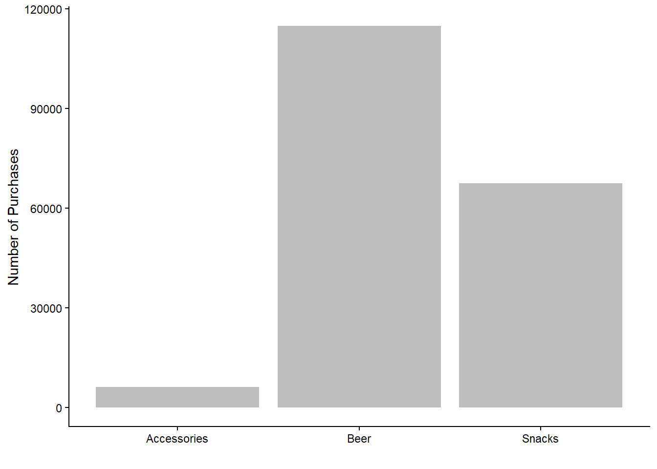
As expected, the majority of purchases fall within the beer category. Purchases of accessories are notably fewer compared to beer and snacks, which aligns with the idea that snacks and beers require more frequent replenishment. However, this graph does not differentiate between which customers made the purchases; it only shows the total number of purchases per product category.
Next, let’s explore the number of purchases per category across different purchase channels (digital vs. non-digital).
# Number of Purchases - Category and Purchase Channel
beer_data %>%
  rename(`Purchase Channel` = Purchase_Channel) %>%
  ggplot(aes(x = Category, fill = `Purchase Channel`)) +
  geom_bar(position = position_dodge()) +
  labs(x = "", y = "Number of Purchases") +
  theme(legend.title = element_blank())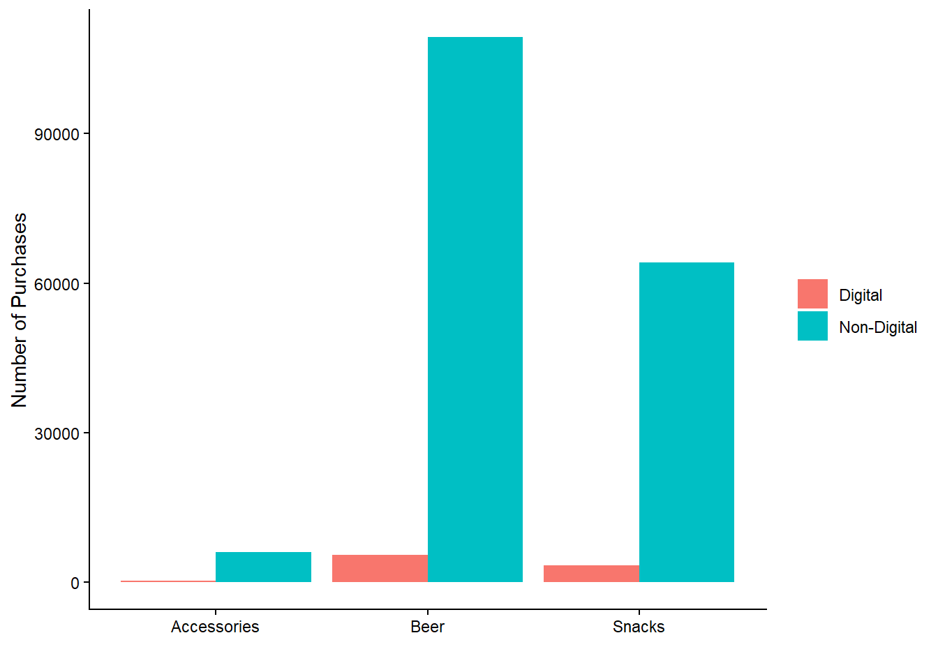
We observe that non-digital purchases dominate across all categories. Interestingly, there are almost no digital purchases for accessories, possibly indicating that customers prefer a more personalized buying experience for these items, such as direct contact with a salesperson.
We can further analyze the data by examining the number of purchases per customer tier across product categories, using facets to create four plots in one.
# Number of Purchases - Customer Tier, Category and Customer Segment
beer_data %>%
  ggplot(aes(x = Customer_Tier, fill = Category)) +
  geom_bar(position = position_dodge()) +
  labs(x = "", y = "Number of Purchases") +
  facet_wrap(Customer_Segment ~ ., scales = "free_x") +
  theme(
    legend.title = element_blank(),
    axis.text.x = element_text(size = 7, angle = 45, vjust = 0.5)
    )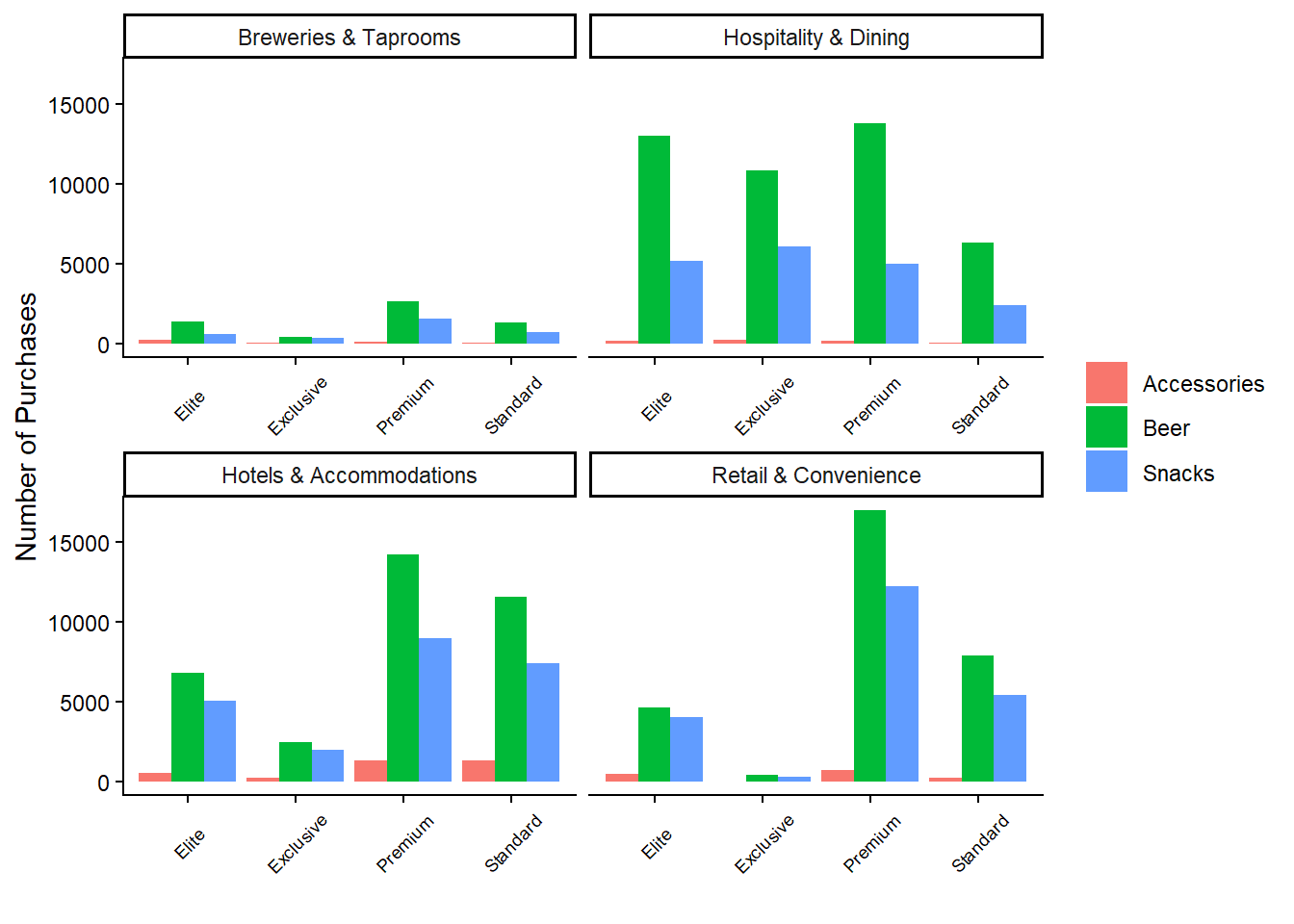
This plot reveals that beer products consistently lead in the number of purchases across almost all combinations of customer tier and segment. Notably, the majority of purchases by “Exclusive” and “Elite” customers occur within the hospitality segment. Conversely, the retail and hotel segments are predominantly composed of “Standard” and “Premium” customers. The breweries segment has the lowest number of purchases overall.
While the above graph highlights the sources of most purchases, it’s also crucial to examine revenue sources. Therefore, we need to create a similar graph, but with revenues on the y-axis.
# Revenues - Customer Tier, Category and Customer Segment
beer_data %>%
  ggplot(aes(x = Customer_Tier, y = Revenues, fill = Category)) +
  geom_col(position = position_dodge()) +
  labs(x = "", y = "Number of Purchases") +
  facet_wrap(Customer_Segment ~ ., scales = "free_x") +
  theme(
    legend.title = element_blank(),
    axis.text.x = element_text(size = 7, angle = 45, vjust = 0.5)
    )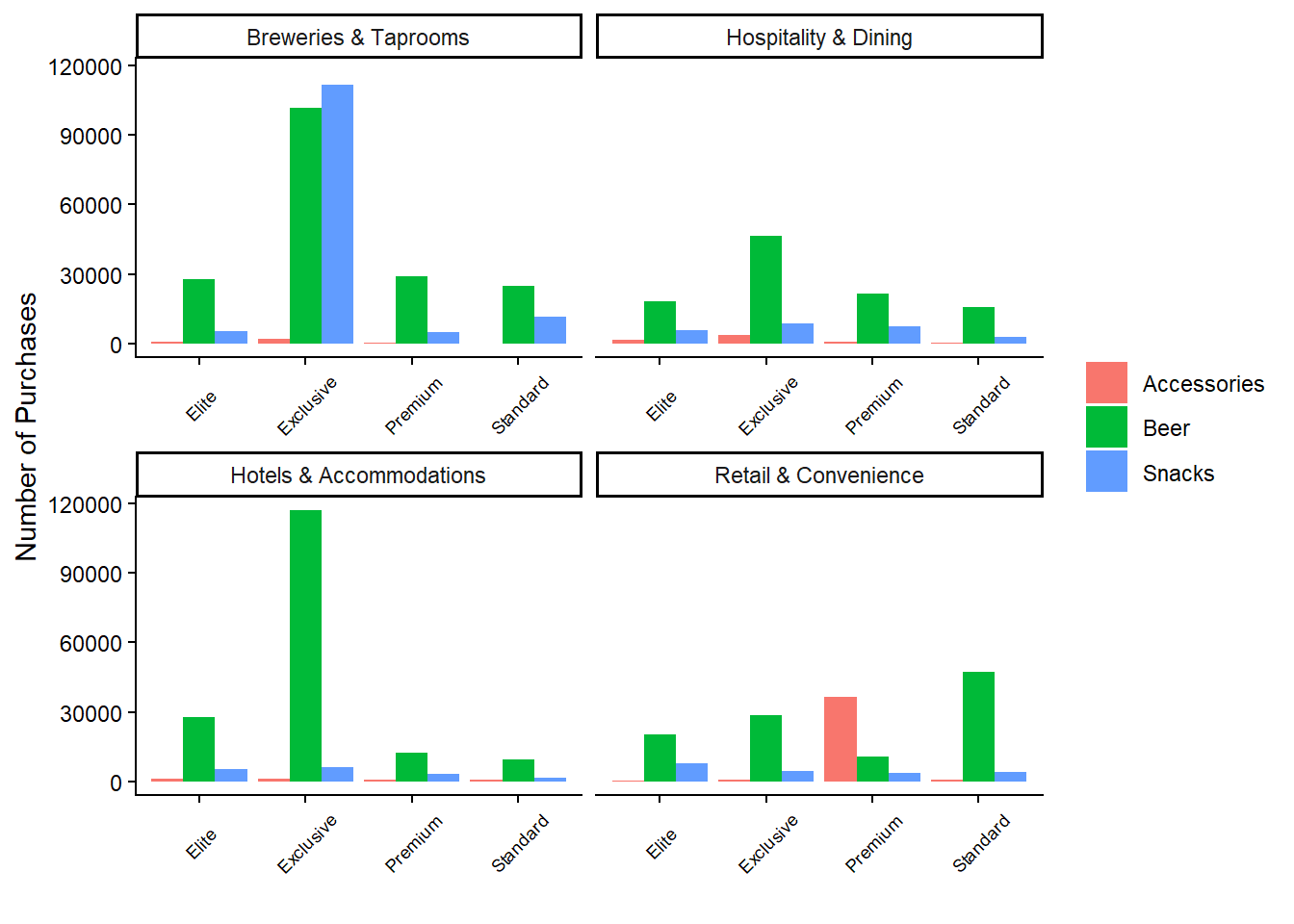
This graph reveals some surprising insights. Despite fewer purchases, the breweries segment generates the highest revenues among exclusive customers. Additionally, the exclusive customers in the hotels and accommodations segment contribute the most revenue for beer products. Interestingly, premium customers in the retail segment generate high revenues from accessory purchases, suggesting that these customers prioritize accessories over beer or snacks. Overall, it appears that the number of purchases does not strongly correlate with revenue.
Before concluding the data exploration, let’s also examine the number of customers who have reported complaints. To do this, we join the complaint_data data frame with the beer_data data frame based on customer ID, using the left_join() function and count() function.
# Number of Customers that reported Complaints
beer_data %>%
  select(Customer_ID, Customer_Tier) %>%
  distinct() %>%
  left_join(
    complaint_data %>% select(Customer_ID, Complaints) %>% distinct(),
    by = "Customer_ID"
    ) %>%
  count(Complaints, name = "Number of Customers") %>%
  mutate(Complaints = ifelse(is.na(Complaints), "No", "Yes")) %>%
  mutate(Percentage = `Number of Customers`/sum(`Number of Customers`)) %>%
kable()| Complaints | Number of Customers | Percentage |
|---|---|---|
| Yes | 13316 | 0.6894124 |
| No | 5999 | 0.3105876 |
The results show that nearly 70% of customers have reported some form of complaint, leaving about 30% who have never reported any issues. While this does not provide direct insights into customer churn at this stage, it’s noteworthy that a significant portion of customers have never lodged complaints.
Key Points from the EDA:
Beer products dominate in terms of purchase volume across all customer tiers and segments, although the number of purchases doesn’t always align with revenue generated.
Non-digital purchases account for the majority of transactions across all categories, with accessories being particularly dependent on non-digital channels.
Revenue analysis reveals that high-tier customers, especially in the breweries segment, contribute significantly to total revenues despite fewer purchases.
Accessory purchases generate substantial revenue among premium customers in the retail segment, indicating a potential niche market.
A significant portion of customers (70%) have reported complaints, though the relationship between complaints and customer churn remains to be explored further.
Defining Customer Churn
The EDA provided valuable insights into our data set, helping us understand key patterns and behaviors. However, the EDA did not specifically address customer churn. To investigate customer churn, we need to establish a clear and specific definition.
In our case, we are dealing with non-contractual churn, meaning we cannot directly observe from the data when a customer actually churns. This differs from contractual churn, where the presence of a contract makes it easier to detect churn. In contractual settings, a customer who does not renew their contract is considered to have churned immediately after the contract’s end date, though they may effectively churn earlier by becoming inactive before the expiration date.
For non-contractual settings, a precise and consistent way to predict customer churn is to define a time period after which, if a customer makes no purchases, they are considered to have churned. This approach aligns with empirical studies such as Tamaddoni, A., Stakhovych, S., & Ewing, M. (2016). The idea is that significant gaps in a customer’s purchase behavior could indicate a high risk of losing that customer. In this context, customer churn is viewed as a period of inactivity, which may be temporary (Tamaddoni et al., 2016).
The challenge is determining the appropriate time period. While there is no definitive right or wrong answer, this time period needs to be selected thoughtfully. Tamaddoni et al. (2016) propose the following method to define this time period based on the data:
Sort all customers in ascending order based on their average interpurchase times.
Set the time period approximately equal to the average interpurchase time of the last customer in the 99% mass of the sorted customer base.
Following this approach, we calculate the average time between purchases for each customer, resulting in an average interpurchase time. We then find the 99th percentile value of this distribution to set as our time period.
However, we suggest two adjustments to this approach. Firstly, it is more robust to use the median interpurchase time rather than the average, as the median is less sensitive to outliers. Secondly, the 99th percentile can result in a very long time period, potentially extending beyond what is practical for effective predictive modeling. For this reason, we choose the 95th percentile instead (with further justification below).
Below is the code to calculate the median interpurchase time per customer and determine the 95th and 99th percentiles of the resulting distribution.
# Sort the data set
beer_data <- beer_data %>% arrange(Customer_ID, Date)

# Create a data frame with the median time interval for each customer
interpurchase_times <- beer_data %>%
  group_by(Customer_ID) %>%
  mutate(
    Time_between_Purchases = as.numeric(difftime(Date, lag(Date), units = "days"))
    ) %>%
  ungroup() %>%
  group_by(Customer_ID) %>%
  summarize(Median_Value = median(Time_between_Purchases, na.rm = TRUE)) %>%
  ungroup() %>%
  na.omit()

# Find the 95th percentile of all the median time intervals
interpurchase_time_95 <- quantile(interpurchase_times$Median_Value, 0.95)

# Find the 99th percentile of all the median time intervals
interpurchase_time_99 <- quantile(interpurchase_times$Median_Value, 0.99)
The histogram below shows the distribution of all the median interpurchase times. Noticeably, the 99th (red line) percentile is significantly further out than the 95th (blue line) percentile. I believe choosing the 95th percentile is more appropriate, as it still provides a substantial time window for analysis without extending unnecessarily. Doubling the time period to capture a few more outliers does not significantly enhance the model’s predictive power. As mentioned, there is no absolute rule for defining this time window; choosing the 94th or 96th percentile would also be reasonable depending on the context.
# Plot all the median time intervals
interpurchase_times %>%
  ggplot(aes(x = Median_Value)) +
  geom_histogram(fill = "skyblue", bins = 30) +
  geom_vline(aes(xintercept = interpurchase_time_95),
             linetype = 2,
             color = "blue") +
  geom_vline(aes(xintercept = interpurchase_time_99),
             linetype = 2,
             color = "red") +
  labs(x = "Median Time Interval", y = "Number of Median Time Intervals")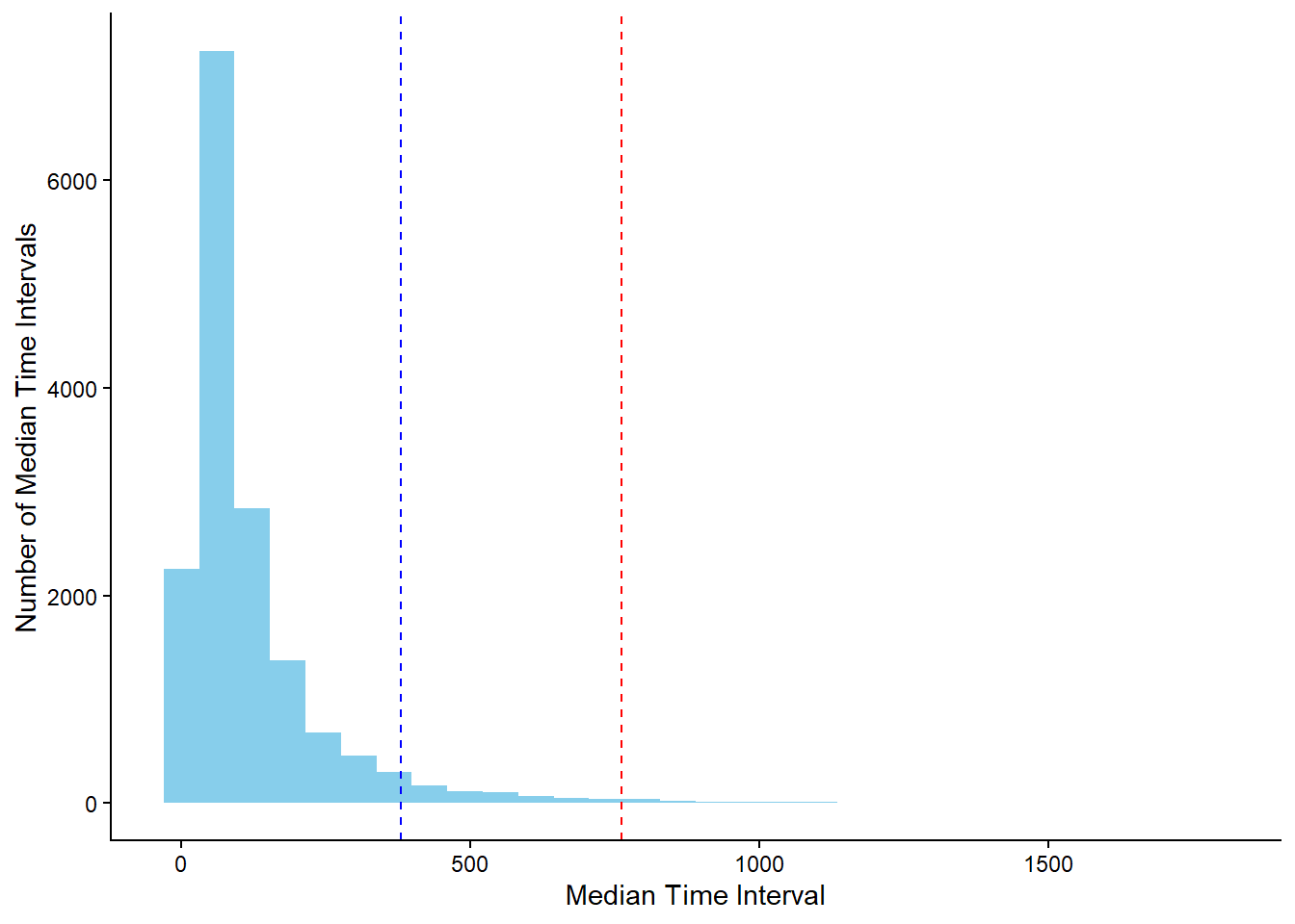
The value of the 95th percentile is approximately 365. Therefore, we assume that a customer churns if there is no purchase for at least one year.
Modeling Customer Churn
Now that we have established a definition for customer churn, the next step is to address the question: how can we model customer churn effectively?
In practice, we always have access to the purchase data, which we can use to predict whether a customer will make a future purchase. Thus, our training-test split should mirror how we would apply the model in a real-world scenario.

The training process involves using purchase data from the first three years as input features, and the fourth year’s data to check if a customer made a purchase or not. This aligns with our previously defined time period of approximately one year. The features from the first three years serve as independent variables, while the presence or absence of a purchase in the fourth year serves as the dependent variable. This setup allows us to create a predictive model to predict customer churn.
For the testing phase, we use data from the first four years to predict churn in the fifth year. Since we have the fifth-year data, we can evaluate model performance by comparing the predictions made at the end of the fourth year (“prediction moment” in the diagram) with the actual outcomes. While random training-test splits could be used, this approach more accurately reflects how the model would function in practice.
The code below illustrates how we create the training and test sets, including integrating complaints data. The final datasets include the customer ID, the binary target variable (churn or no churn), and the initial predictors. These predictors encompass recency, frequency, and revenue for each product category, as well as customer segment, customer tier, average interpurchase time, and the total number of complaints.
# Training Set - Filter on Date
training_set <- beer_data %>%
  filter(Date <= max(Date) - 2 * interpurchase_time_95)

# Complaints - Filter on Date and Summarize
training_set_complaints <- complaint_data %>%
  filter(Date <= max(Date) - 2 * interpurchase_time_95) %>%
  group_by(Customer_ID) %>%
  summarize(Complaints = sum(Complaints)) %>%
  ungroup()

# Training Set - Filter on Date
training_set_churn <- beer_data %>%
  filter(Date > max(Date) - 2 * interpurchase_time_95 &
           Date <= max(Date) - 1 * interpurchase_time_95) %>%
  pull(Customer_ID) %>%
  unique()

# Training Set - Create Features
training_set <- training_set %>%
  group_by(Customer_ID) %>%
  mutate(
    Average_Time_between_Purchases = mean(as.numeric(difftime(Date,  lag(Date), units = "days")), na.rm = TRUE)
    ) %>%
  group_by(
    Customer_ID,
    Category,
    Customer_Tier,
    Customer_Segment,
    Average_Time_between_Purchases
    ) %>%
  summarize(
    Revenues = sum(Revenues),
    Recency = as.numeric(max(Date) - 2 * interpurchase_time_95),
    Frequency = n()
    ) %>%
  ungroup() %>%
  pivot_wider(
    names_from = "Category",
    values_from = c("Revenues", "Recency", "Frequency")
    ) %>%
  left_join(
    training_set_complaints,
    by = "Customer_ID"
    ) %>%
  mutate(across(c(starts_with("Revenues"),
                  starts_with("Frequency"),
                  "Complaints"), ~if_else(is.na(.), 0, .))) %>%
  mutate(across(c(starts_with("Recency"),
                  "Average_Time_between_Purchases"),
                ~if_else(is.na(.), 999, .))) %>%
  mutate(
    Churn = if_else(Customer_ID %in% training_set_churn, "No Churn", "Churn"),
    Churn = factor(Churn, levels = c("Churn", "No Churn"))
    )
# Test Set - Filter on Date
test_set <- beer_data %>%
filter(Date <= max(Date) - 1 * interpurchase_time_95)
# Complaints - Filter on Date and Summarize
test_set_complaints <- complaint_data %>%
filter(Date <= max(Date) - 1 * interpurchase_time_95) %>%
group_by(Customer_ID) %>%
summarize(Complaints = sum(Complaints)) %>%
ungroup()
# Test Set - Filter on Date
test_set_churn <- beer_data %>%
filter(Date > max(Date) - 1 * interpurchase_time_95 &
Date <= max(Date) - 0 * interpurchase_time_95) %>%
pull(Customer_ID) %>%
unique()
# Test Set - Create Features
test_set <- test_set %>%
group_by(Customer_ID) %>%
mutate(
Average_Time_between_Purchases = mean(as.numeric(difftime(Date, lag(Date), units = "days")), na.rm = TRUE)
) %>%
group_by(
Customer_ID,
Category,
Customer_Tier,
Customer_Segment,
Average_Time_between_Purchases
) %>%
summarize(
Revenues = sum(Revenues),
Recency = as.numeric(max(Date) - 1 * interpurchase_time_95),
Frequency = n()
) %>%
ungroup() %>%
pivot_wider(
names_from = "Category",
values_from = c("Revenues", "Recency", "Frequency")
) %>%
left_join(
test_set_complaints,
by = "Customer_ID"
) %>%
mutate(across(c(starts_with("Revenues"),
starts_with("Frequency"), "Complaints"),
~if_else(is.na(.), 0, .))) %>%
mutate(across(c(starts_with("Recency"),
"Average_Time_between_Purchases"),
~if_else(is.na(.), 999, .))) %>%
mutate(Churn = if_else(Customer_ID %in% test_set_churn,
"No Churn",
"Churn"),
Churn = factor(Churn, levels = c("Churn", "No Churn")))Predictive Modeling Methodology
For predictive modeling, we use the random forest methodology, an advanced ensemble learning technique based on decision trees. Using the tidymodels framework in R, we initialized the model by specifying the method (random forest), the R package (ranger), and the mode (classification), as our task is to predict whether a customer will churn.
# Random Forest - Model
rf_model <- rand_forest(trees = 1000,
                        mtry = tune(),
                        min_n = tune()) %>%
  set_engine(engine = "ranger") %>%
  set_mode("classification")
As you may notice, the model definition does not include specific hyperparameter values. Instead, the function tune() is filled for the arguments mtry (the number of predictors to sample at each split) and min_n (the minimum number of data points in a node for further splitting) using cross-validation.
To enhance model performance and ensure data representation, we use the concept of a “recipe” in tidymodels. A recipe is a flexible framework for data preprocessing, enabling a sequence of transformation steps such as normalization and principal component analysis (PCA). The following recipe excludes the variable Customer_ID by changing its role (it is no longer a predictor), standardizes all numeric predictors, implements PCA to all the standardized numeric predictors and puts the rare categories within the categorical variables into a single group.
# Random Forest - Recipe
rf_recipe <- recipe(Churn ~ ., data = training_set) %>%
  update_role(Customer_ID, new_role = "ID") %>%
  step_scale(all_numeric_predictors()) %>%
  step_pca(all_numeric_predictors(), threshold = 0.85) %>%
  step_other(all_nominal_predictors())
After creating the recipe, we combine it with the model to construct a workflow, which integrates feature engineering and random forest model application.
# Random Forest - Workflow
rf_workflow <- workflow() %>%
  add_model(rf_model) %>%
  add_recipe(rf_recipe)
While it is possible to experiment with alternative preprocessing steps, such as using Partial Least Squares (PLS), our objective is to demonstrate a straightforward and effective approach for predicting customer churn.
Model Optimization and Validation
The plan involves using cross-validation to optimize hyperparameters. Though cross-validation on the training set may not always yield the absolute best model, it is a practical approach to prevent overfitting and improve model robustness. We divide the training set into 5 folds, using 4 for training and 1 for testing in each iteration of cross-validation, covering all combinations of hyperparameters using grid.
The reason why we used the tune() function instead of specific values is because we want to test the values 2 and 3 for the mtry parameter and the values of 20, 40, 60, 80 and 100 for the min_n parameter.
# Grid Search for hyperparameters
rf_grid <- expand.grid(mtry = 3:4, min_n = seq(20, 100, 20))
To summarize, we implement a random forest model with a specific recipe for feature engineering. The hyperparameters of the model were determined using 5-fold cross-validation on the training set, resulting in 50 different model evaluations due to multiple hyperparameter combinations. The tune_grid() function facilitates this process, storing the outcomes. The ROC-AUC metric was used for performance evaluation.
# Random Forest - Cross Validation
rf_results <- rf_workflow %>%
  tune_grid(resamples = vfold_cv(training_set, v = 5),
            metrics = metric_set(roc_auc),
            grid = rf_grid,
            control = control_grid(save_workflow = FALSE,
                                   verbose = FALSE,
                                   parallel_over = "everything"))
To visualize the results, use the autoplot() function on the resulting object.
# Plot the results
rf_results %>% autoplot()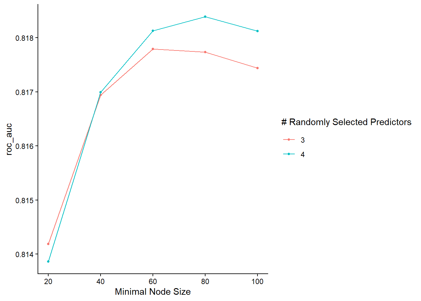
The graph reveals that the model performs better with 4 randomly selected predictors (mtry), especially with a relatively large minimum node size.
Final Model Evaluation
To evaluate, we select the best model variation based on the ROC AUC score, fit it on the entire training set, and made predictions on the test set.
# Select the best model
rf_final_model <- rf_results %>% select_best(metric = "roc_auc")

# Fit the best model in the training set
# Make predictions on the test set
results_on_test_set <- rf_workflow %>%
  finalize_workflow(rf_final_model) %>%
  fit(training_set) %>%
  predict(test_set, type = "prob") %>%
  bind_cols(Churn = test_set$Churn)

# Print first rows
head(results_on_test_set)
# A tibble: 6 × 3
.pred_Churn `.pred_No Churn` Churn
<dbl> <dbl> <fct>
1 0.0217 0.978 No Churn
2 0.111 0.889 No Churn
3 0.293 0.707 Churn
4 0.482 0.518 No Churn
5 0.333 0.667 No Churn
6 0.268 0.732 Churn The results provide the probabilities of “Churn” and “No Churn” for each test set observation, alongside actual values. We can visualize the ROC curve and calculate the ROC AUC Score on the test set.
# ROC plot
results_on_test_set %>%
  roc_curve(Churn, .pred_Churn) %>%
  autoplot()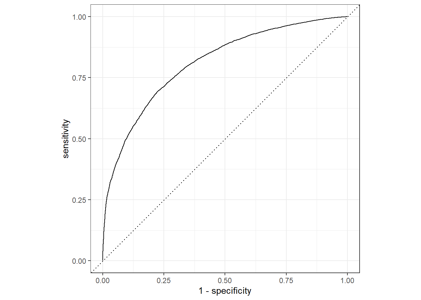
# AUC Score
results_on_test_set %>%
  roc_auc(Churn, .pred_Churn)
# A tibble: 1 × 3
.metric .estimator .estimate
<chr> <chr> <dbl>
1 roc_auc binary 0.810The ROC AUC score on the test set is consistent with the cross-validation results, indicating no overfitting and affirming the practical applicability of the model for predicting customer churn. While further refinements in hyperparameters, feature engineering, or performance metrics are possible, the objective of this report is to showcase using the tidymodels framework for predictive modeling in non-contractual settings.
References
Tamaddoni, A., Stakhovych, S., & Ewing, M. (2016). Comparing churn prediction techniques and assessing their performance: A contingent perspective. Journal of Service Research, 19(2), 123–141.